Variations of a Candy Cane.

CANDY CANES!

From Wikipedia: “The Candy Cane was first manufactured in the 1920’s when Bob McCormack in Albany, Georgia first started making them as Christmas treat, giving them out to children, family, friends, and co-workers.

(phot0  from room envy)

Candy Cane production was a labor intensive process, done only by hand, until the candy cane machine was invented in the 1950’s by Bob McCormack’s brother in-law, Gregory Keller, who was also a Catholic priest.

 This machine made it possible to ship candy canes and it made the production of the traditional Christmas treat a lot easier. The candy cane machine transformed Bob’s Candies Inc. into the largest producer of candy canes in the world.”

Today the Candy Cane pattern is used on very non- candy, non-typical things.

Interior designers love it!

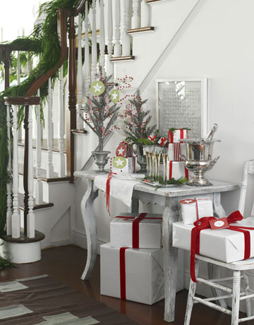
The house of Hanna shows us this understated, but festive, candy caned colored foyer.
Or, how about investing $80.00 for your little Christmas toddler’s Candy Cane feet?!

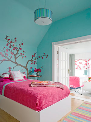
Oh what fun it is to  –  see this playful take  on a teen bedroom.  (From ideasBest)

Packages wrapped in white never get tired when they have the energizing zing of candy cane color.

 Or, if you dare –  you could try your personal kitchen variation on the candy color scheme.
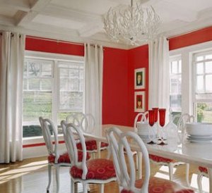
OR, for some real Christmas cheer, you could pretend that you are me . . .

Okay, maybe that’s not really me.

But the candy cane phenom is real!

Enjoy as many variations as you can think up!

Dianne Ross

Interior Designer / Phelans Interiors

363-9634

What is IKKAT? IKAT?


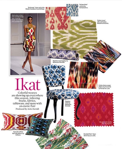
Right now Ikkat is the absolute “must have”  fabric/pattern in the interior design world. It is showing up everywhere and on nearly everything from shoes to sofas! The word itself means “to bind.”

This collage was on design sponge.


Wikipedia gives us this definition: Ikat, or Ikkat, is a dying technique used to pattern textiles that employs a resist dyeing process similar to tie-dye on either the warp or weft fibres.

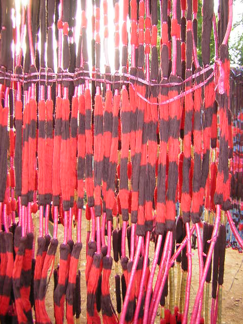
Actually the process is really NOT like tie-dye because the fibres are dyed before they are woven into fabric.  The color variation exists in the threads first.  When something is tie-died the fabric is bundled (tied) together and then dyed. Take another look.  This collage is from

Haley on home design


What a beautiful technique!

And old – very old! Some antique patterns come from South America, India, as well as in the caucuses. If you decide that you are in love with these rare and hand-made delicacies be prepared to spend some serious cash. To make a proper Ikat fabric is labor intensive and time-consuming, hence the large price tag.

 But if you are like me and really love the look of variation in colors and geometric patterns, as shown above in the collages, many companies produce look-alike knock-offs.  And, as far as I can tell, either spelling – one K or two, is correct.

This shows a piece of original IKAT fabric.


We have several gorgeous Ikkat patterns available for sofas and chairs from vendors like Thomasville and Norwalk.  All  the fabric lines ( Kravet, Robert Allen, Fabricut, etc) offer  a tempting aray of colors and patterns. Obviously adaptable down through the centuries, the design characteristics of Ikat can be playful, loud, subtle, soft and or sophisticated.

Photo from style-files.


Once you fall in love with these patterns you will want more, more, more!

So what is Ikat?

The quiz is coming! 

But, no worries.  You know all about it now.

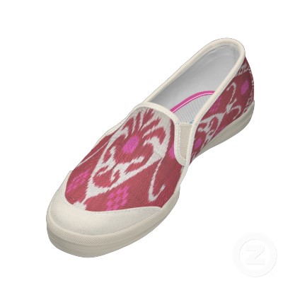
Ikat shoes from Zazzle

Enjoy the wonderful weekend everybody!


Dianne Ross

Interior designer / Phelans Interiors

363-9634

Hot Las Vegas Furniture Market says: Stay Cool.

Hey! Happy hot summer days everybody!

 I love it when the sun shines and we have wild colored zinneas in bloom under cornflower blue skies!


So, you might expect a blog about HOT colors today, but alas you would be wrong!

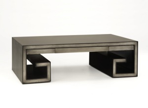
Today,we are going to stay cool. We are going to tone it down, keep it sleek, and admire tones almost without any color at all. The company Brownstone has introduced this collection at the Vegas market. It’s just too gorgeous to keep it under wraps. The finish is silverleaf.

 And  the details are delightful! Here a touch of zen, there a touch of French curves, and all done with an editor’s eye.

Here is what the company has to say about the collection they have named “Fairmont”.


Brownstone introduces the Fairmont Collection with this sneak preview of our first showing of the Fairmont collection, a unique collection of silver leaf case goods.

We’ll  be showing this group for the first time at the Las Vegas Furniture Market this August 1-5.  Be sure to visit us in showroom A100 if you plan on attending, and to see the craftsmanship on this group.

This group is NOT production at this time, but if we receive a good response at Vegas then we will most likely have stock around Nov-Dec.

The smouldering bling of  the silverleaf finish is perfect for cooling off on a hot summer day, wouldn’t you agree?

Dianne Ross

Interior Designer/Phelan’s Interiors

363-9634

RE-POST: Turquoise – I just can’t get enough!


I posted this about a year ago, but it is one of my favorites,

 so enjoy all these uplifting images!

Better Homes and Garden photo

I loved last week’s post (COLOR) so much I couldn’t let it go. Looking for photos online of all things turquoise I stumbled upon a blog called House of Turquoise. Check it out, but before you go there, here we go again! There should be something for everybody today.

 Enjoy!

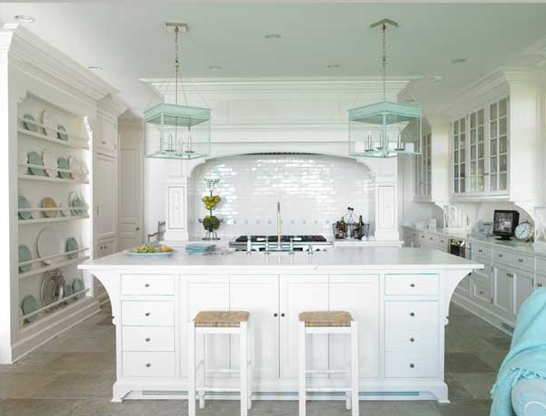
I want this kitchen.

and the York wallpaper shown below. . .

Here’s another remarkable room.

Skona Hems shares this room with us.

Peonies and a book – simple.

Pretty – from another blog called Centsational Girl.

(the seashell is a green turbot)

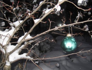
And here’s a lovely little bauble from my own garden taken 4 or 5 years ago.

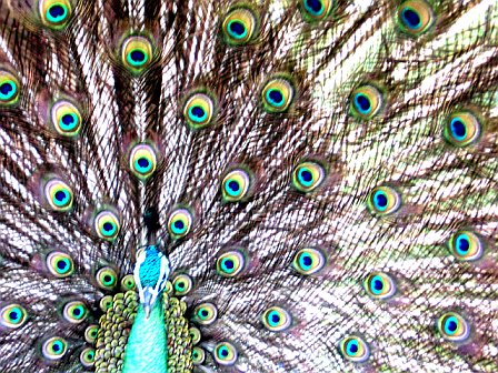
This guy I photographed as he strutted his stuff on a Texas farm.

Now  “just for fun!”

And today’s finale:  turquoise Gibson Guitar SG Special!

 Thank you, Pantone, for Turquoise!

 THE END!

Dianne Ross

Interior Designer

Phelan’s Interiors

363-9634


 SOMEBODY STOP ME!!!

“Boho Chic” – Finally a real trend!

I have been waiting for this trend to make it’s way into the home furnishing market! If you have a bit of gypsy color in your blood, then you will love this new collections from  Norwalk Furniture:

                                                              “BOHO CHIC” 

 Street Art, graffiti, celebrities, and even some “1960’s cop-an-attitude” come together to create this mischievous, sophisticated look.

Nothing is too cute here, thankfully. Norwalk did a great job of keeping the look just gritty enough to stay on the edgy side. 

If you like what you see here, you will love the “real deal”!  Watch this video and then come on down to the store! See you soon!

http://www.youtube.com/embed/9s9DHn_Iccg


Dianne Ross

Interior Designer/Phelan’s Interiors

363-9634

PS  Norwalk is an American company – made in Ohio.

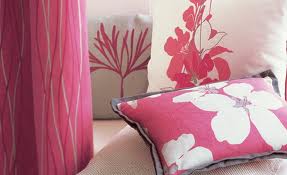
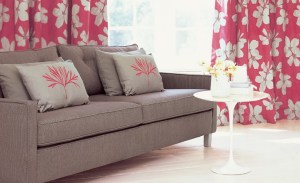
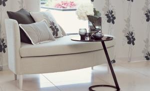
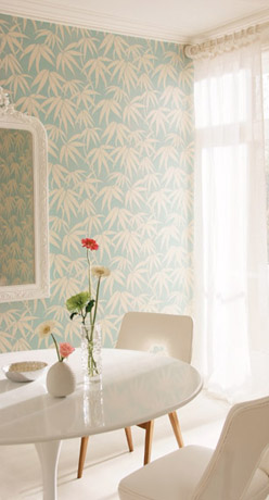
Fresh Spring FLOWERS in fabric!

Spring is here! Spring is here!


Well, if you live in Iowa and think 40 degrees, without a trace of sunshine is spring, you’d be right on the money.  Hey, at least it’s April!


Everybody is SO ready for some spectacular spring weather with flowers blooming all around, so today here is a pick-me-up until our flowers really do unfold.


The fabrics are from Villa Romo and the wallpapers are from Harlequin.


Mmmmm – You can almost  smell the lilacs.


Dianne Ross

Interior Designer/Phelans Interiors

363-9634

Interior Design 2011 – What’s In?!

So, if you are one of those with “IDS” , or as we say in this business,          Interior Design Sickness, you can’t help yourself – you must read on.


Is it circles or squares for 2011?

Yes!

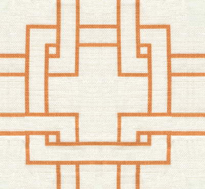
 Kravet fabrics


Is it black or espresso?

Yes!

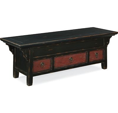
Thomasville bench 


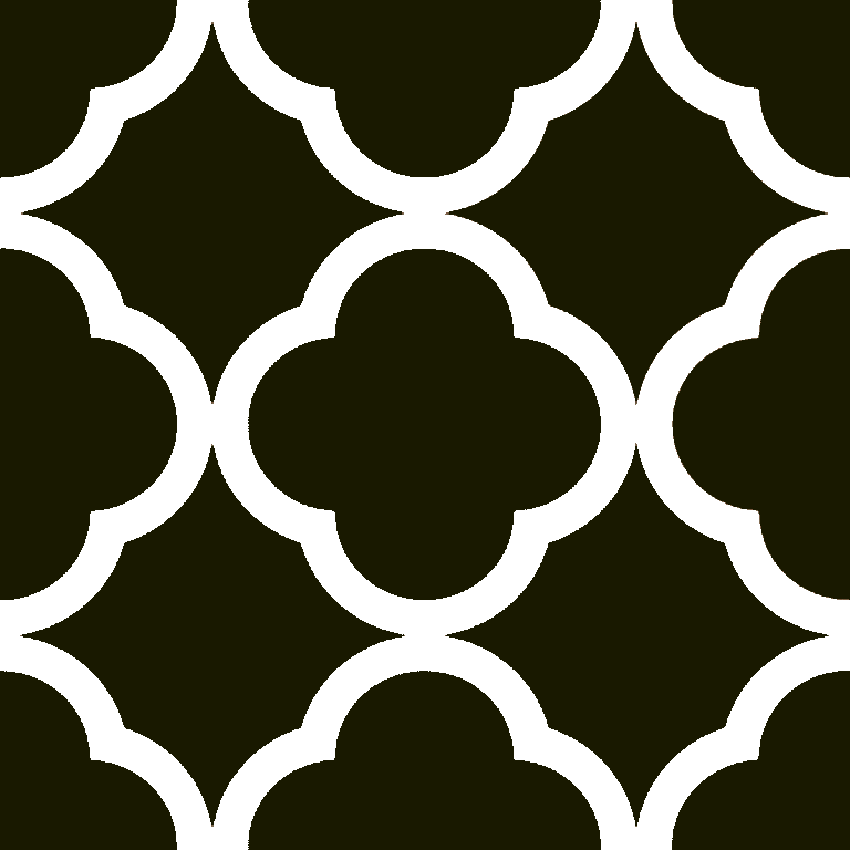
Is it clean cut and linear or fanciful quatrefoil??                                                    Modern or traditional for 2011?

Yes!


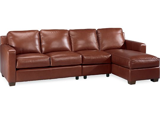
Thomasville  Metro sectional 

Kravet fabric


Is it Adrenaline or Xanax?

Yes!


First dibs


Greek key bench

The answer is YES!


Dianne Ross

Interior Designer/Phelan’s Interiors

363-9634

Honeysuckle – HOT HOT HOT!


Last year’s Pantone color of the year was turquoise because of its calming effect (much-needed after a tumultuous 2009). This year, they’re forecasting a way more vibrant color: Honeysuckle! According to Pantone Color Institute Executive Director Leatrice Eiseman, “In times of stress, we need something to lift our spirits. Honeysuckle is a captivating, stimulating color that gets the adrenaline going – perfect to ward off the blues.” (Ariel Kaiser)

So, what DOES the color “honeysuckle” look like? According to pantone it is a hot pinkish-coral! That works! But many people see yellow or orange when they hear the word “honeysuckle.”     

Here is a sample, a tempting snack, if you will, for your eyes. Prepare for Honeysuckle 2011!                 

interior photos by rhonna designs

I am SO ready for honeysuckle! Thank you, Pantone!


Dianne Ross

Interior Designer/Phelan’s Interiors

363-9634


A Little SpringFever-Teaser!

Ah – sunshine! And seeing the earth reappear beneath the melting snow! It puts people in their happy place. We are craving  fresh air and  crazy colors!

So here we go – a little spring fever-teaser from the countries that call themselves Latinos. . . the home of Latin lovers. Enjoy the visual feast!


My gorgeous Columbian friend, Jackie.

A client told me that yesterday he was so excited about the balmy February weather that he slipped into a pair of shorts and had a cocktail on his porch.

Prepare for Spring! Enjoy the visual feast!


From Brazil

and Venezuela

and Columbia, of course!

And  fromCuba

Well – Okay – maybe NOT!


Enjoy all the colors! Enjoy your week END!

Dianne Ross

Interior Designer / Phelan’s Interiors

363-9634

Beauty IN, Ugly OUT!

As Nancy Grace would say, “Bombshell tonight!”


It’s still winter!

 Okay, so it’s not exactly a bombshell in a journalistic sort of investigative report, but it does sound intriguing!


 Here’s the truth –  I really just wanted  to continue with last week’s theme:

How to BEAT The Winter Blahs


because


 In the past few days we have received several pieces of magnificent artwork: magnificent in size, magnificent in color and incredibly magnificent with the

WOW! Factor! 

There are also pieces of  “fun” sculpture – some whimsical, some very sophisticated and, as always, some classically romantic pieces.

If you are craving an art-fix, stop in and admire these creative works of art.


 We will help you find beautiful.

So, as it turns out, this is an invitation! 

What a great way to beat the Winter Blahs


“Bombshell tonight!”

52 more days till spring.


Dianne Ross

Interior Designer / Phelan’s Interiors

363-9634 


Dianne Ross

Interior Designer / Phelan’s Interiors

363-9634